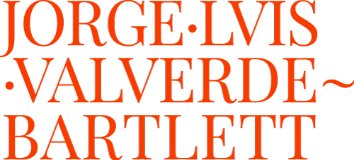
The Logo

This section helps me and my collaborators use my logo for various visual communication materials. It establishes standards and guidelines for consistency in the logo and my personal identity.

Concept

The design of 19th-century piano sheet music book covers reflected the artistic and cultural trends of the Victorian era, blending elegancecraftsmanship, and ornamentation. Key elements of these designs included elaborated typography, decorative flourishes and ornaments, engraved illustrations, monochromatic or minimal color schemes, and symmetry and balance. These covers were visually appealing and served as collectible art objects, mirroring the elegance and refinement of the music they encased.

Keywords

Color Psychology

The black, gray, and orange colors create a powerful, balanced brand identity. They signal a serious and cutting-edge professional environment, projecting professionalism while emphasizing innovation and energy.

Washed Black

Basic
Methodical
Efficient

RGB: 36 36 36
HTML: #242424
CYMK: 71% 65% 64% 71%

Timeless Gray

Classical
Logical
Deliberated

RGB: 148 148 148
HTML: #949494
CYMK: 44% 36% 37% 2%

Vibrant Orange

Energizing
Communicative
Persuasive

RGB: 242 137 0
HTML: #f28900
CYMK: 2% 56% 100% 0%

Typography

The Playfair type family is a serif typeface known for its elegance, readability, and sophisticated aesthetic. Inspired by the transitional design of the late 18th century, Playfair features high contrast between thick and thin strokes, giving it a classic yet modern feel suitable for a refined and distinguished look.

Playfair Display

Playfair Display

Playfair Display

Playfair Display

Playfair Display

Playfair Display

AaBbCc

Playfair Display is a multi-weight type. Designed by Claus Eggers Sørensen.

Official Logo

The logo is a combination of text, images, symbols, and colors that distinguishes my brand and name from my competitors. It serves as a visual representation that creates a connection with my audience or customers.

Official Icon

Think of my icon as a brand’s stylistic extension. Once the big picture of a brand’s messaging has been established, icons serve as visual tools that help carry out the same message. Icons are also useful elements that can be consistently used across diverse platforms.

Color Guide

Every application of my logo should strengthen and reinforce the organization’s positive image. The logo is a fixed design element that may not be edited, but the color composition may change depending on background images, colors, or materials.

White

N/A

Primary Color

N/A

Secondary Color

N/A

Accent Color

N/A

N/A

Black

N/A

Do's & Dont's

To ensure that my logo is always recognizable, it must
be used consistently, with discipline and precision.
The power of a logo is easily weakened by its incorrect use.

No Compress

No EXPAND

No BLUR

No BORDERS

No SKEW

No FLIP

No ARBITRARY ROTATION

No CRAZY COLORS

No INCOMPLETE

No ART FILTERS

No SHADOWS

No OUTLINES

Share on